Kawaiization Design Strategy
Applied psychological research on visual design and emotional response to redesign ADT's web design system, producing a 30% lift in sessions-to-opportunities conversion on the Smart Home page.
- Team
- 1 UX Lead1 UXR1 UXD
- Timeline
- A/B testing across high-volume pages
- Category
- Product Strategy
- Impact
- 30% sessions-to-opportunities lift
Published: Apr 2021
TL;DR
ADT's design system used rigid, drab visual language that potentially worked against the company in a purchase context. I initiated a project grounded in psychological research on visual design and emotional response — hypothesizing that softer, brighter, more rounded design would put users at ease and increase conversion. The web design team applied Kawaiization principles to the design system and tested on high-volume pages. The Smart Home page A/B test produced a 30% lift in sessions-to-opportunities conversion. We scaled the approach sitewide through ADT's design system (Axis) and observed an overall conversion uptick.
Context & Challenge
The Hypothesis
As Director of Product Design, I initiated and led the strategic vision of this project — overseeing the UX and UI team and owning communication with the executive team.
Psychological research suggests that people feel positive emotions in response to rounded corners, bright colors, and soft textures — and feel anxious or threatened by sharp edges and rigid structures. The reference point I drew from: Ingrid Fetell Lee's 2018 TED Talk, Where Joy Hides and How to Find It, which synthesizes documented research on the relationship between visual design and emotional state.
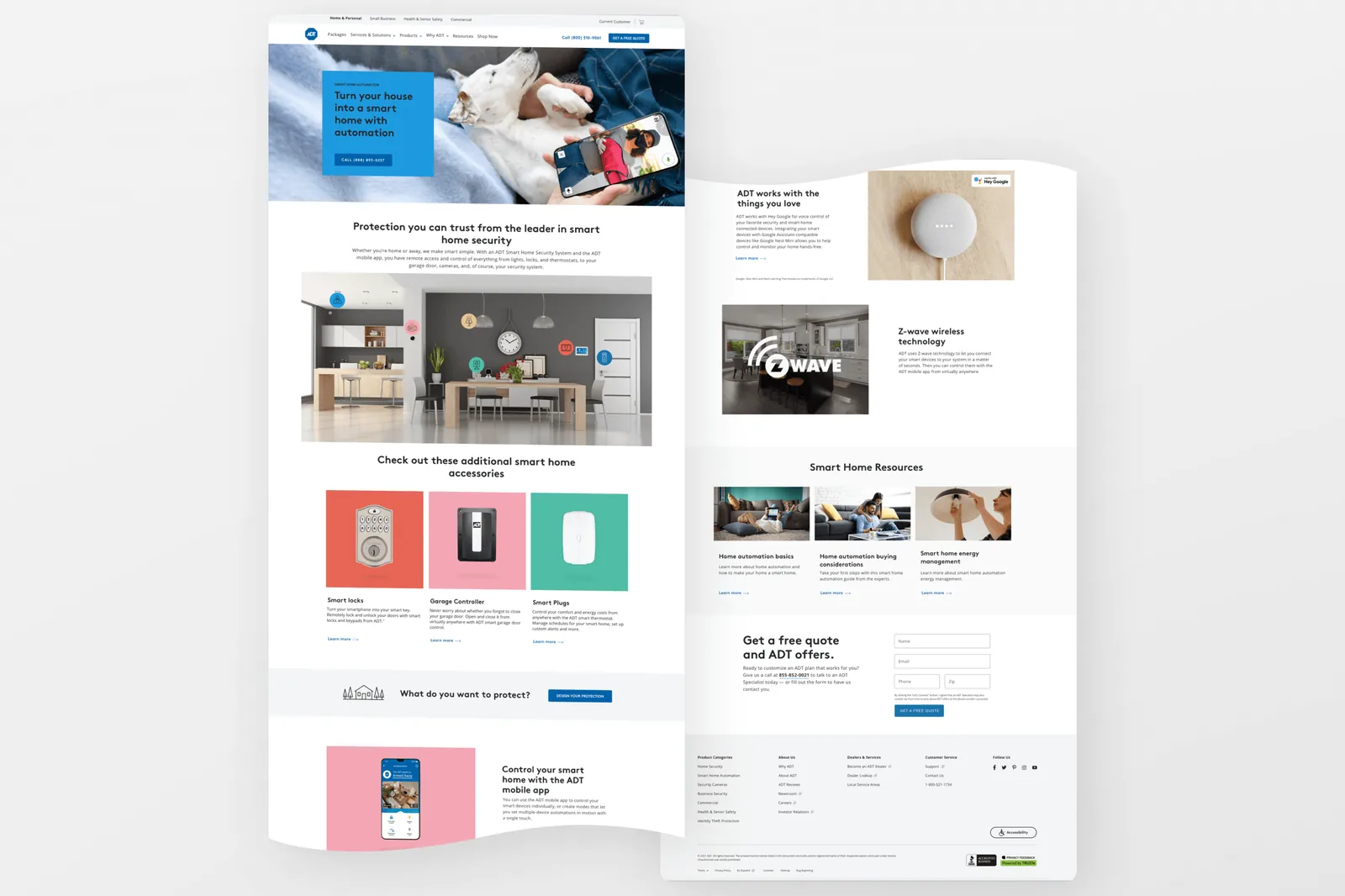
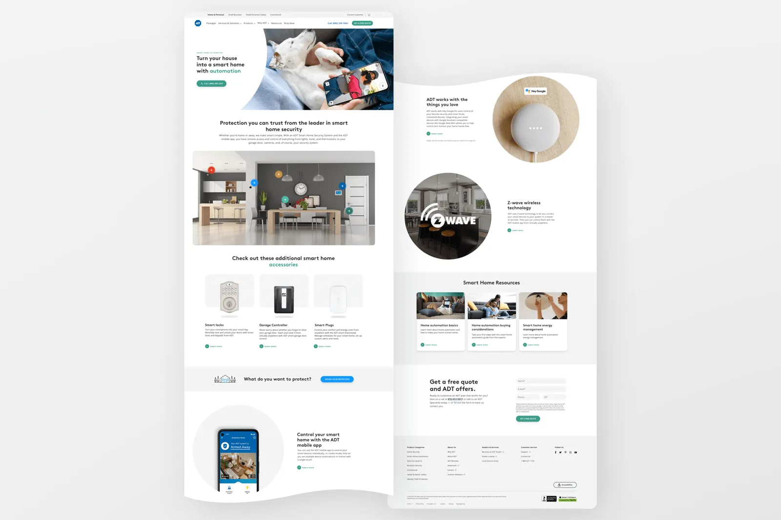
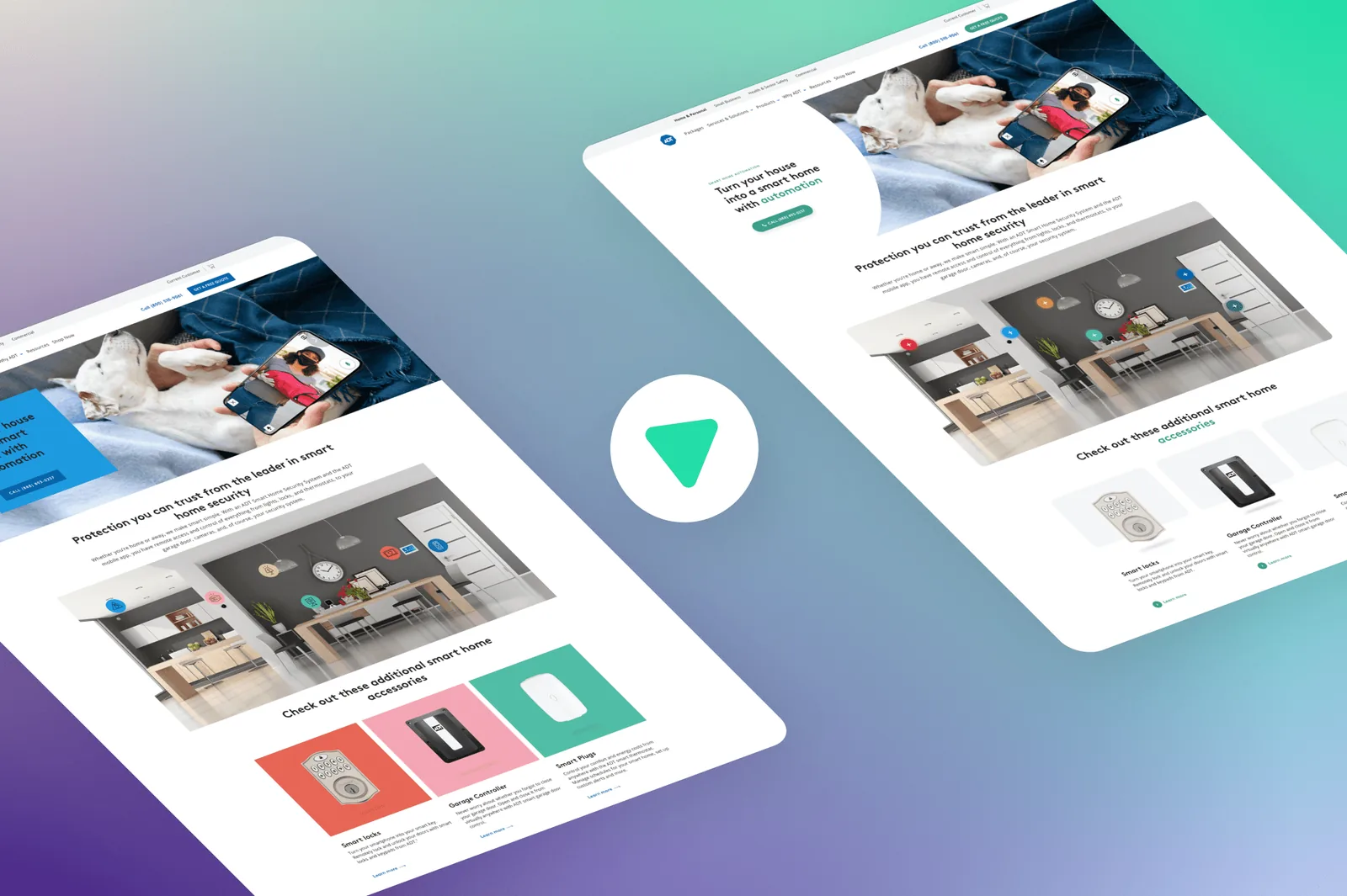
At the time, ADT's brand guidelines and design system used rigid corners and dull color schemes. The visual language was authoritative and serious — which made sense for brand positioning, but potentially worked against the company in a purchase context where trust, warmth, and approachability matter.
My hypothesis: by redesigning the website using the principles of Kawaii (the Japanese concept of cuteness — characterized by rounded forms, bright colors, and approachable aesthetics), we could increase conversion by putting users at ease and evoking feelings of trust.
Design & Solution
What We Changed
I asked the web design team to iterate on our design system by making four key changes:
- Rounding corners — moving from rectangular, hard-edged components to softer, rounded forms throughout the interface
- Softening the color palette — reducing the heaviness of ADT's dark, security-coded color scheme in favor of warmer, more approachable tones
- Using brighter textures and photography — replacing flat, corporate imagery with photography that felt more human and inviting
- Creating more white space — giving the layout room to breathe, reducing visual density and cognitive load
Each change was tied directly to the psychological mechanism we were testing — not arbitrary aesthetic improvements.
Testing the Hypothesis
We A/B tested the redesigned system on several high-volume pages on adt.com with live traffic. The Smart Home page was the primary test surface — a page where users were evaluating ADT's smart home security offerings and deciding whether to take the next step.
Leadership & Collaboration
Initiating the Project
This project started with a strategic hypothesis, not a user complaint or a data anomaly. I initiated it based on research I was tracking — an example of bringing external intellectual input into the design practice rather than only responding to existing signal.
Getting buy-in for a project grounded in psychology rather than traditional UX research required communicating the rationale clearly and connecting the hypothesis to business outcomes stakeholders cared about: conversion rate, not design philosophy.
I directed the design team to apply the Kawaiization principles systematically across the design system — not just on one page, but as a cohesive set of changes that could be evaluated consistently.
Impact & Outcomes
Test Results
The Smart Home page A/B test showed a 30% lift in sessions-to-opportunities conversion rate — a significant effect on a high-stakes metric at the point where a user moves from browsing to taking a step toward purchase.
Scaled Sitewide
Based on the Smart Home page results, we scaled the principles of Kawaiization sitewide to ADT's design system (Axis). Post-rollout, we observed an overall uptick in conversion rate across the site. The design system that had been rigid and drab became softer, brighter, and more human — and it converted better.
Kawaiization changed how the team thought about the relationship between visual design and conversion. Prior to this project, visual design decisions were primarily brand-driven. The project demonstrated that visual design choices are conversion levers, not just brand expressions — and established a model for hypothesis-driven design at the system level: form a clear hypothesis grounded in research, design a testable implementation, measure with real traffic, and scale what works.