Everon Platform Launch
Led UX strategy and research for eSuite, a complete reimagining of Everon's (formerly ADT Commercial) enterprise security platform—uncovering critical usability gaps mid-project and driving iterative improvements before general release.
- Team
- 1 UX Lead3 UXD1 PM1 EM
- Timeline
- 12 months
- Category
- B2B Security Platform
- Impact
- Critical gaps found & addressed in beta
Published: Aug 2023
TL;DR
Everon (formerly ADT Commercial) was midway through a major platform redesign when I joined as Head of UX. I found insufficient user validation in a product nearing launch—only five beta testers engaged, with critical usability gaps unaddressed. I immediately conducted focused beta research, uncovered six significant issues across event history, service requests, navigation, reporting, and task efficiency, and drove iterative improvements before general release. The platform launched during the company's $1.6B private equity acquisition. The research approach established a model for user-validated design that the team carried forward.
Context & Challenge
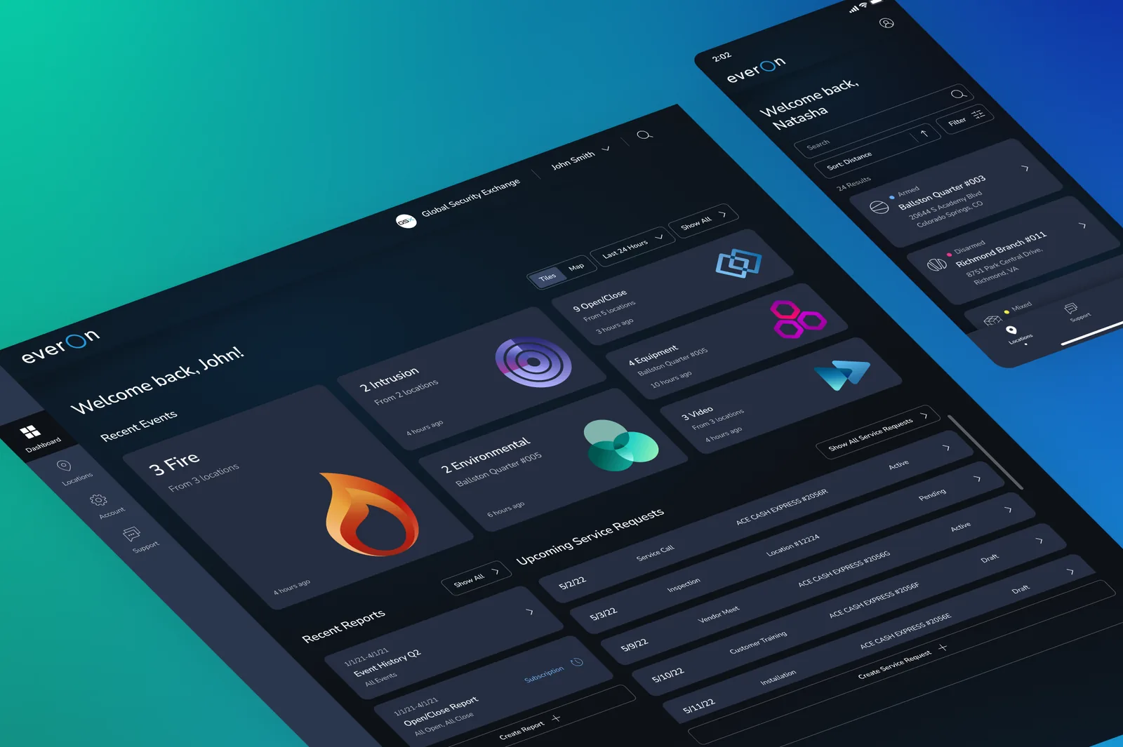
The Platform
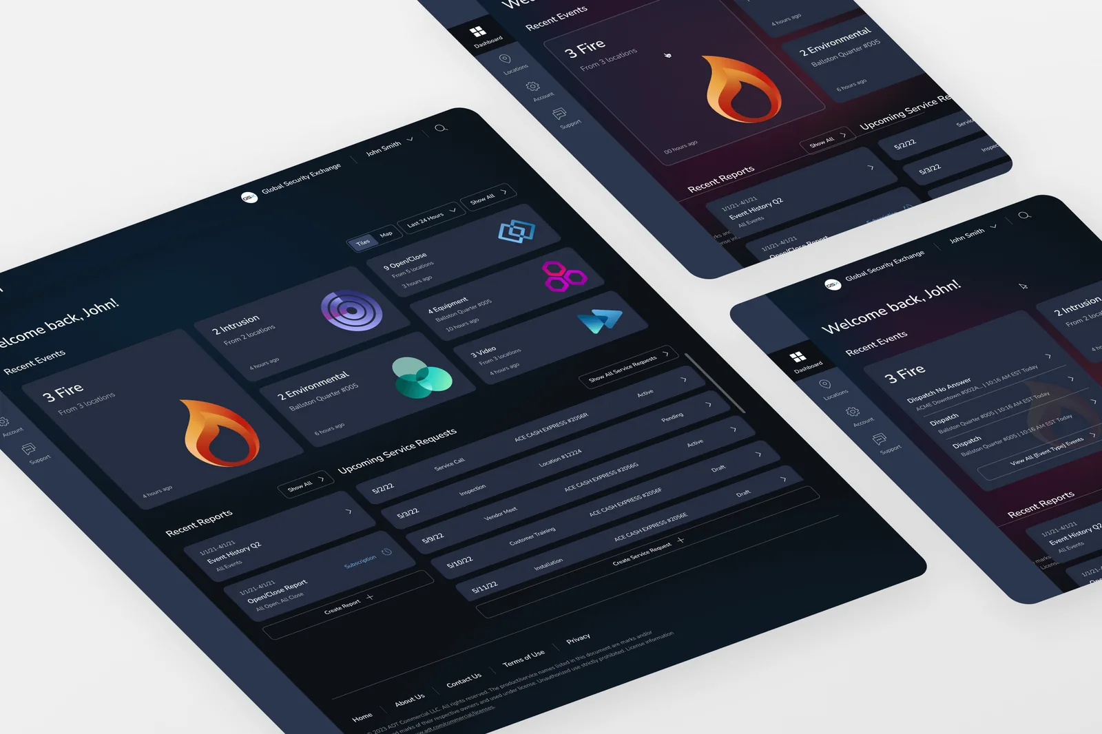
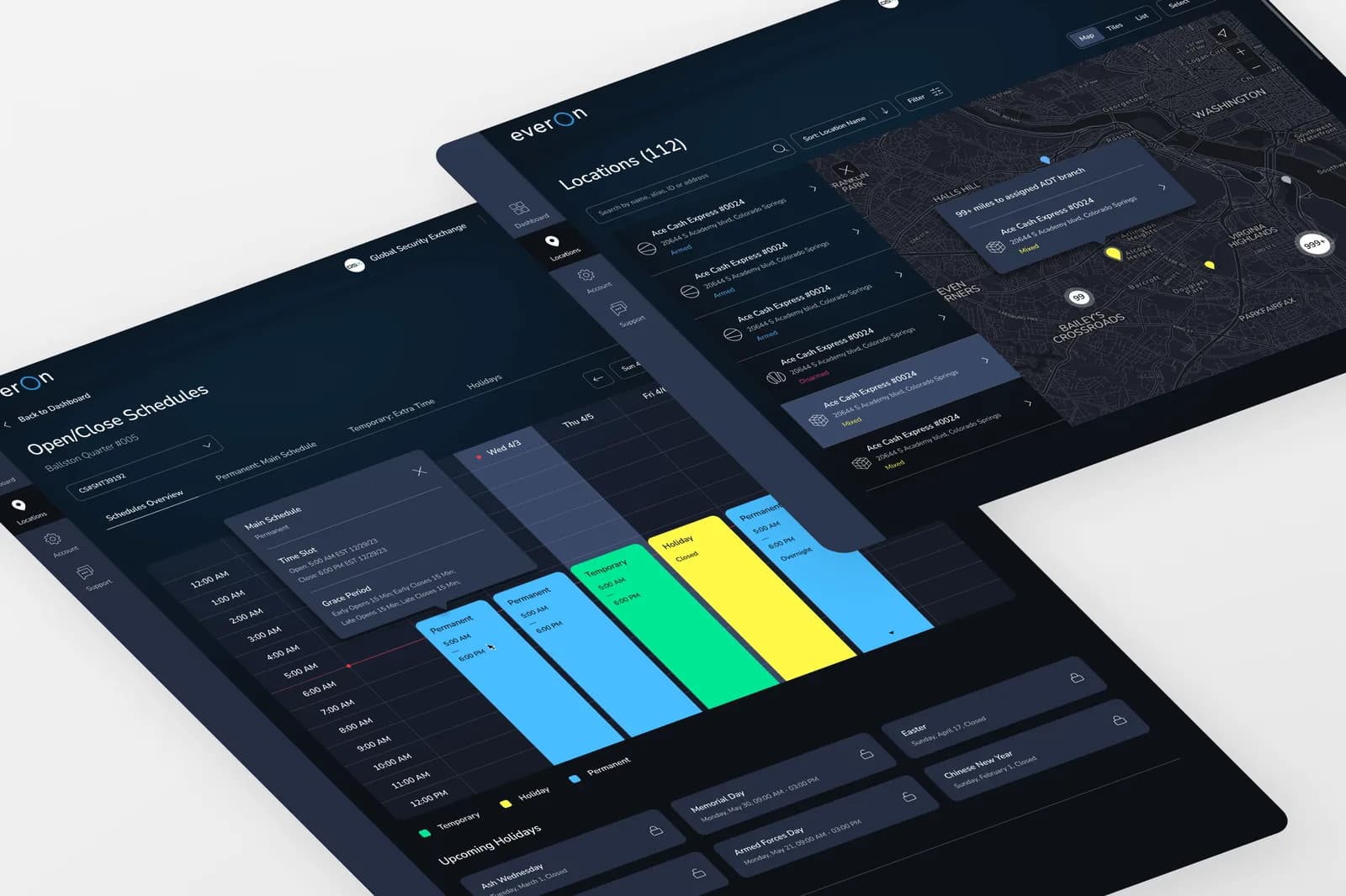
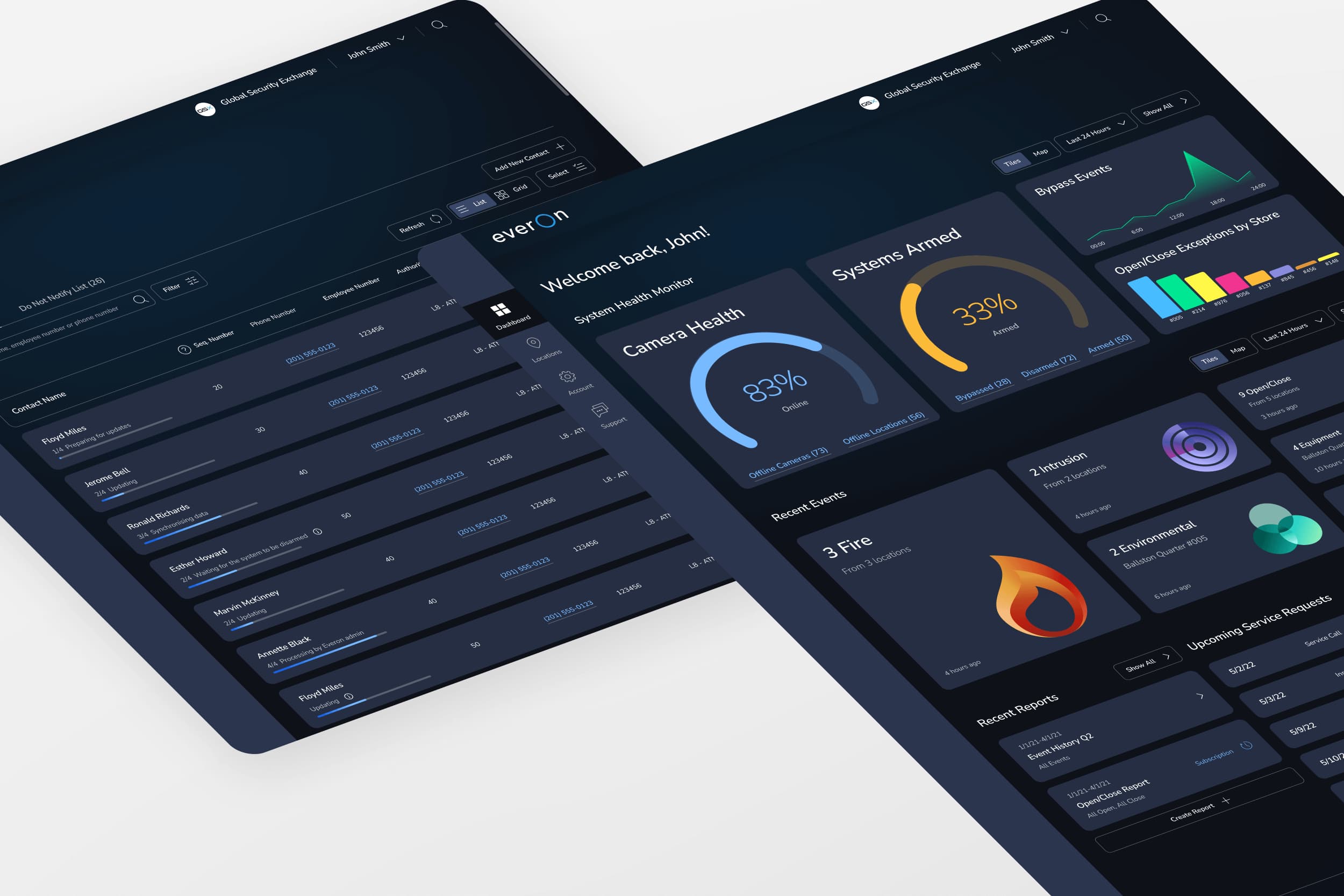
eSuite is Everon's flagship customer engagement platform, used by enterprise customers to manage security and life safety operations across multiple locations—covering activity monitoring, billing, user management, reporting, and service request workflows. The redesign team operated under three core principles: Simple, Loveable, Complete.
Joining Mid-Project
I was hired to create and lead the UX team at ADT Commercial before the company's $1.6 billion private equity acquisition in August 2023. I joined mid-project into a structure where the PM and EM were already leading with multiple external agency partners and limited internal UX ownership.
The Problem I Found
On arrival, I immediately assessed the state of user validation. What I found: insufficient usability testing and beta customer feedback gathering. Only five beta testers had been engaged, and the research wasn't surfacing the depth of signal needed to validate the redesign's core assumptions. I agreed that wasn't clear yet, and acted immediately.
Research & Discovery
Rapid Beta Research
I conducted interviews with beta users to assess platform performance while the product was still in development and changes were actionable. The goal was to understand whether the "Simple, Loveable, Complete" principles were landing in practice—and what was getting in the way.
Key Findings
Six critical opportunity areas surfaced through the research:
-
Event history oversimplified. The new interface stripped out details users depended on, omitting information crucial to accomplishing their objectives. In trying to simplify, the design had removed functionally necessary context.
-
Service request workflow was disorienting. Users found the flow cumbersome and lost track of where they were in the process.
-
Contact management navigation was confusing. Users couldn't reliably find or manage contacts, creating friction in a high-frequency task.
-
Reports were missing or broken. Certain frequently-used reports were absent entirely; others displayed no data—a direct regression from the predecessor system.
-
Users wanted customizable layouts. The design defaulted to fixed layouts, but users expected configurable experiences common in enterprise software.
-
High-priority tasks required too many clicks. Key actions took more steps in the redesign than in the predecessor, undercutting the "Simple" design principle.
These weren't cosmetic issues—they were functional gaps that would have shipped to customers if the research hadn't surfaced them.
Design & Solution
Iterative Improvements Driven by Research
I initiated a round of iterative improvements directly informed by user feedback, working with product and engineering to prioritize and sequence changes for future releases:
- Event history: Restored key data fields and surfaced the contextual information users needed
- Service requests: Simplified and restructured the workflow to provide clearer progress indicators
- Contact management: Clarified the navigation structure to make contact-related tasks more findable
- Reporting: Identified missing reports and data pipeline issues, added to the development backlog
- Remote arm/disarm: Developed a prototype for the arm/disarm feature that numerous customers had explicitly requested
Leadership & Collaboration
How I Led
Establishing the research baseline. I identified the gap in user validation quickly and didn't wait for the next planning cycle to address it. I organized and ran the beta interviews myself to get signal fast.
Aligning stakeholders on findings. The research findings were uncomfortable—they showed the product wasn't ready in ways the team hadn't fully surfaced. I presented findings clearly and tied each issue to user behavior and business risk, which made it possible to prioritize action rather than debate.
Managing agency partners. With multiple contractor teams in the mix, I worked to consolidate UX direction and ensure iterative improvements were implemented consistently, not in isolation by separate vendors.
Impact & Outcomes
What Changed Before Launch
The beta research directly informed improvements that shipped before general release: event history redesign, service request workflow restructure, contact management navigation improvements, report coverage and data pipeline fixes, and a remote arm/disarm prototype queued for future release.
Business Context
The platform launched during the $1.6B private equity acquisition of ADT Commercial, rebranded as Everon. Getting the UX right at this moment carried organizational weight beyond the product itself—it was part of the story the company was telling to the market about its transformation.
Taking ownership of UX strategy mid-project set a template for how research should integrate into the product process going forward. The beta interview approach—fast, focused, actionable—became the starting point for how the team thought about user validation, and demonstrated the value of having internal UX leadership that owned the research relationship with users.